The Complexities of Color
Posted on January 8, 2018
Theatrical lighting designers have never had more power to choose colors, even to the point of subtly changing hues on the fly during a show. However, with this capability comes a responsibility says Cory Pattak, the host of the popular design focused podcast “in 1: the podcast.”
Now that they are freed from the task of choosing gels long in advance of a production and can dial up a rainbow anytime on their LED fixtures, say Pattak, designers must be careful, not to overthink their color choices or paint the stage with an overabundance of hues, just because it’s possible.
Speaking to us from his New York office, Pattak, whose recent credits include colorful musicals like Singin in the Rain in São Paulo Brazil, In the Heights at the Olney Theatre, the national tour of Flashdance and multiple productions of Newsies, spoke to us about the complexities of color in theatrical lighting.”
Is color playing a more prominent role in theatrical lighting today?
“Color has always been a big part of lighting design, it’s just more accessible now. More and more, we are not choosing gel weeks or months in advance, but choosing the color in the moment during tech because rigs have more LED and color changing equipment. It allows designers to make color choices on the fly more than they ever could. This can be both good and bad.”
Can you elaborate? How has it changed your approach to design?
“I have a love/hate relationship with color. I love the possibilities it allows me, but it’s very easy to become overwhelmed by all the choices and waste time and energy finding the right color. I always procrastinate picking gel until the very last minute the night before a plot is due. I just hate doing it. Even though 95% of the gels I choose are colors I’ve used before and I think I know how they’ll behave.
“There was a famous LD who once said she had her cat pick the color depending on which swatch the cat’s paw went to. Sometimes it does feel that arbitrary and I just hate committing. Which is silly, because changing color in the theatre is so easy to do. I just feel like we never really know how a color is going to work for a certain show until you turn it on. It still often feels like a crapshoot. As for mixing color, a couple years ago I built myself a standard color library which I use on every show. 10 blues, 10 pinks, 10 greens, etc. plus all the standard colors (Cyan, Magenta, Blue, etc.) For every new fixture type I use, I try and take the time to make those colors.”
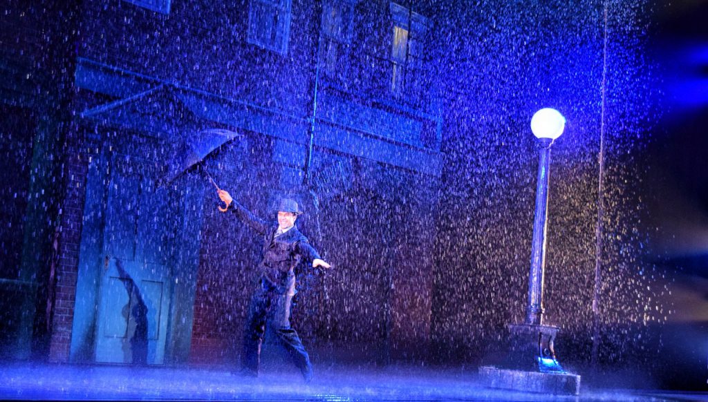
Photo: Cory Pattak
When you lit In The Heights you made marvelous use of colors to reflect a NYC sunset. Can you tell us a little about that?
Something like a sunset naturally lends itself to specific colors, but how do you select your colors when the cue from the plot isn’t so specific? What I mean is when you want to reflect something intangible like a mood rather than something like a time of days that’s strongly associated with a color, how do you go about choosing the right color for a scene? I honestly try not to overthink color.
“My best color picking tool is my gut and my eye. Does it look good? Does it convey the emotion I’m after? Is it vibrant and exciting? If those answers are yes, I move on. For In The Heights, while sitting in the Sitz probe, I had my assistant Rob Siler make a folder of interesting and varied New York sunrises and sunsets. We sat there, prior to the craziness of tech, and made about 12 different looks for the sky trying to match the photos as best as possible. As we teched through the show, I was able to quickly recall some of those looks.”
Is there a lot of collaboration on color choice with directors?
“I don’t find myself talking too much about color with directors. If it’s someone I’ve worked with before, they are usually just letting me do my thing. My conversations with directors (at least in tech) are usually more along the lines of “Can they be brighter?” or “This feels too bright” or “Can that cue be slower/faster?” Sometimes if I’m cueing a song I’ll start taking the color in a very saturated direction and I’ll stop and ask the director “too much?” Sometimes they’ll say “I think let’s save that for this other moment” but generally the answer is no. Also, there is something about bold colors (especially blues and congos) that just makes people think about a big Broadway musical. Those shows are full of moving lights that can do very bright, very deep colors. That was never the case when it was just gel. So there is something subconscious at work even for people who are not lighting proficient that certain looks and colors just feel more “Broadway.” For better or worse, that’s become the gold standard and every regional theatre likes to advertise their shows as “Broadway caliber shows in Sheboygan” or wherever. If you can give them something they think looks “Broadway,” that’s a win.”
Any advice on over-using color or being too heavy handed with it?
“I think setting rules is important. Certain songs and scenes live within a restricted palette. I think having a color library that limits the colors you use also helps pull the show together and make it more cohesive. Before I set up my own color library and I was using the console’s color picker, I could pretty much make any color I wanted at any time. That means over the course of the show, there might be 63 different blues. I think that gets too busy and fussy. And I wasted way too much time picking color. I also think you need to pace your color choices. Don’t blow it all in the preset, or the opening number. If there is a color that looks amazing on the cyc, think about the best moment to use that color for the first time. I’m always trying to get the most bang for my buck. What can we hide, what can we save for later? When a song starts, don’t change the color of every light in the rig yet, then there is nowhere to go. Let it build slowly so the color intensity peaks at the same moment the song does.”
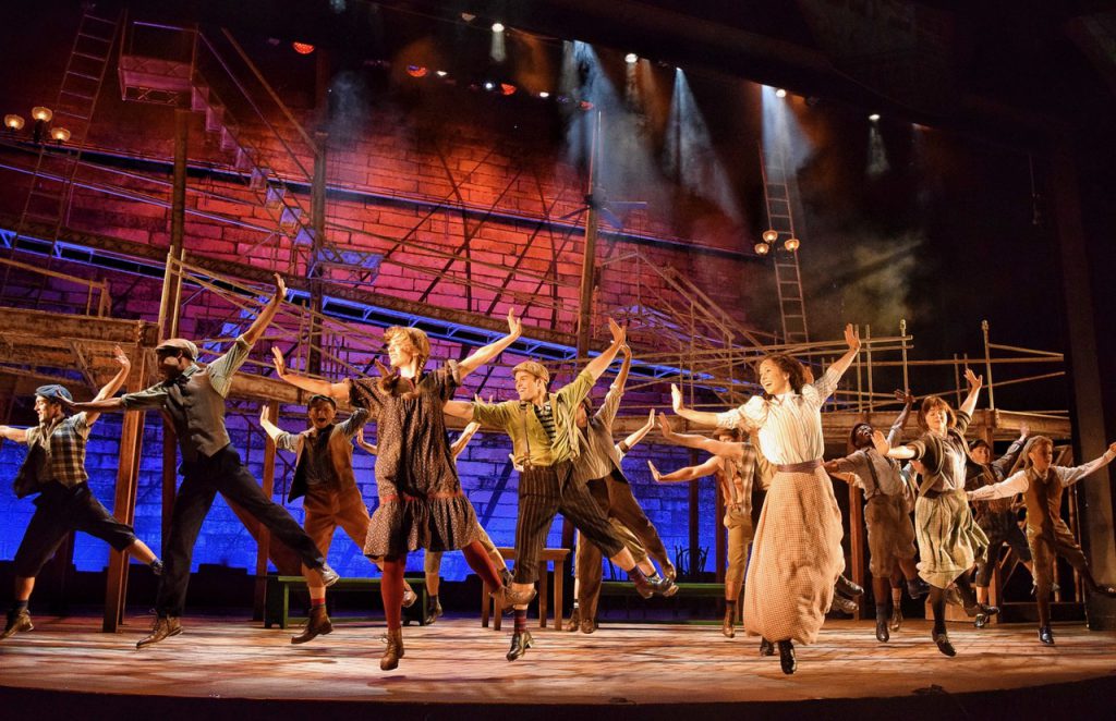
Photo: Cory Pattak
How do you balance the colorizing the stage and key lighting people on it so they don’t have an unflattering tint?
“I rarely have saturated front light. I see other designers do it, it works for them, I don’t like it. I think it makes the actors look strange and unreal…even if it’s a show with fantasy characters or sequences, I’m just not a fan. By keeping the bolder colors coming from angles that don’t hit the performers from the front, I can make sure they still look good even as the world around them changes. I rely more on colored backlight, downlight, and most importantly, the scenery. I love lighting and coloring scenery. Gimme a super textured back wall, or a highly detailed drop, or a stone wall, or a series of portals, I really love playing with color on the environment. One of my favorite things to do is light a big classic overture on just a show drop and portal. I so rarely get to do it, but it always feels so old-fashion and grand when I can. Just like the songs in the overture, it’s like a trailer of things to come.
Although you make great use of brightness and color, we notice that you aren’t afraid to have dark space in your design for impact. Can you talk about the role of dark spaces in your designs? Also, are there colors that you use around dark areas to accent them? “The dark spaces are less a result of color and more the result of texture. I love textures and I use a lot of gobos in my shows, but you might not always notice them. Almost every show (unless it’s an interior play) has a system of Diagonal fronts with a template. It’s super soft (often with frost) and it doesn’t really read as a “gobo system” but it breaks the front light up just enough to create a more textured wash. It also looks much better on the floor and scenery than flat open front light. I love any excuse for performers to move in and out of broken up light.
“My template systems are usually the first lights I’ll turn on when lighting a scene. The worst crime the lighting can commit (aside from not lighting the actors) is just being flat and boring. When lights pile up on each other, they can become both, (as well as becoming white.) Lots of subtle texture helps with that pileup problem and…a secret…if you have lots of purposeful small shadows breaking up the light all over the stage, any instances where that is not intentional, just blend right in. I do love using a cool colored template system as a negative space fill.
“I learned this lesson by not having these lights on a show and desperately trying to scrape it together from spare units. My rule is always “If you can see it, we have to light it.” Which means if there is a scene going on down left, if the ambient light in the room means we can still see all the scenery on the rest of the stage, it needs to be intentionally lit. To me, unaddressed areas of the stage look amateur and ignored. A cool colored broken up system in something like R78 is a great way to just “kiss” everything, give it a little life, and say to the audience “you are seeing this because we are choosing to show it to you.”
Any other advice on colorizing the stage?
“With great color comes great responsibility. I did a show years ago with a white cyc that had a system of very strong yellow striplights. It was highly impactful and I remember the set designer saying “that yellow is great, but use it carefully.” He meant that it had the potential to overpower the stage and that I should use it wisely. This is a good lesson for all color choices. ‘Just because you can, doesn’t mean you should.’ Most LED fixtures do a really deep Purple/UV that makes the floor look amazing. But you can only go back to that well so many times before it becomes routine and banal, so I try and use those colors sparingly.
“Also don’t make the costumes look brown. That’s a capital offense and another lesson I learned the hard way. And think about how much of the audience will see the floor. If there is raked seating, or a mezzanine, or especially if you are doing a show in thrust or the round, the floor is most likely the largest surface that will receive light. Don’t just let the color of the floor be the by-product of all the other lights. I’m obsessed with a clean floor. Treat it like another piece of scenery.
“Color is incredibly powerful. It might be the most powerful tool lighting designers have. Every audience member brings their own feelings and preconceptions about what certain colors mean. The trick is to be both a swordsman, wielding a broad tool, capable of large gestures while also playing a delicate mind game, leading the audience and their emotions down a path they don’t even realize has been chosen for them.”
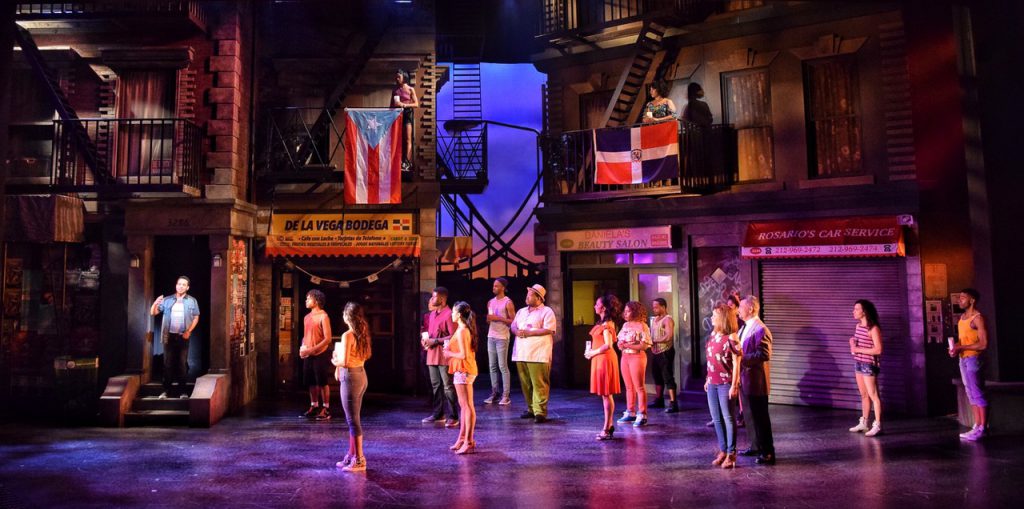
Photo: Cory Pattak